
Duration: 10 Days
Duration: 10 Days
Duration: 10 Days
Tools: Figma, Figjam, Photoshop, Illustrator, iMovie
Tools: Figma, Figjam, Photoshop, Illustrator, iMovie
Tools: Figma, Figjam, Photoshop, Illustrator, iMovie
Role: UX Lead
Role: UX Lead
Role: UX Lead
Team Members: Nelton | Project Manager
Grace | UI Lead
Luann | UX Researcher
Team Members: Nelton | Project Manager
Grace | UI Lead
Luann | UX Researcher
Team Members:
Nelton | Project Manager
Grace | UI Lead
Luann | UX Researcher
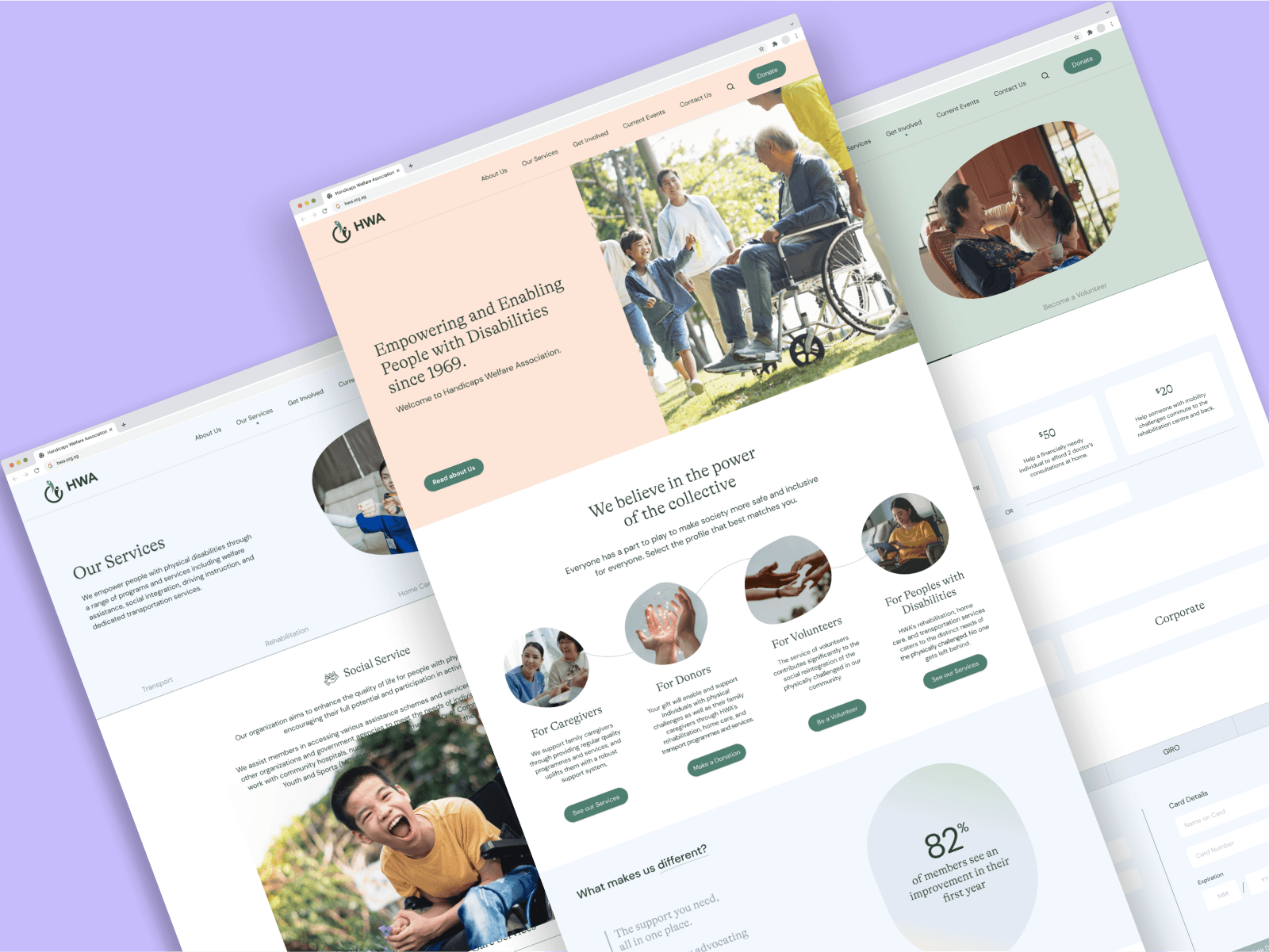
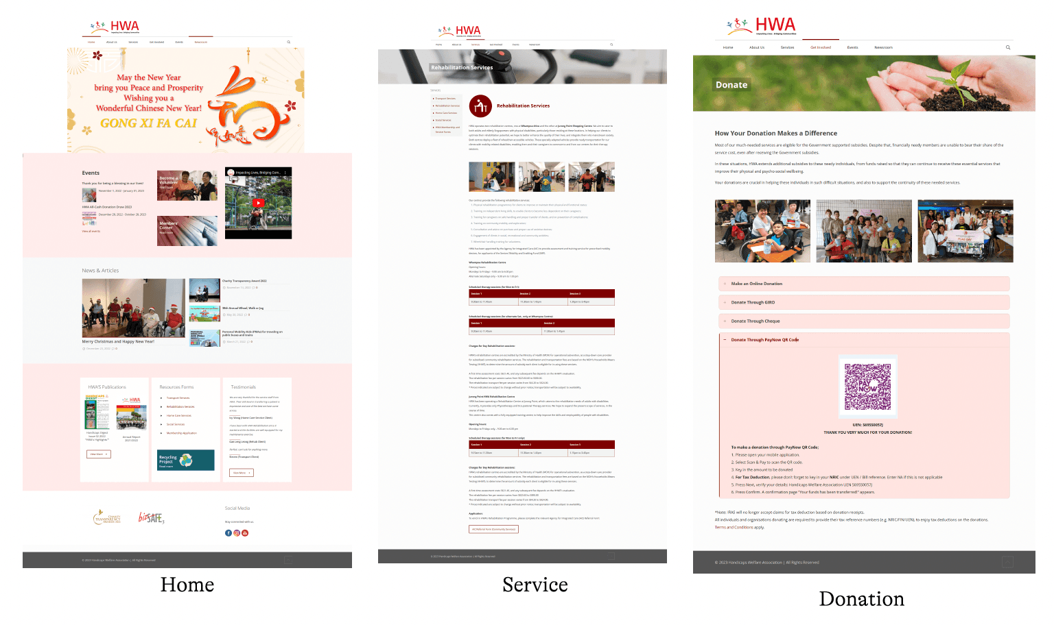
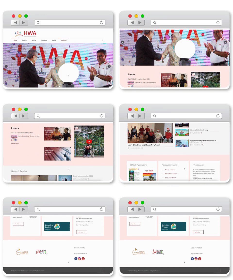
HWA's current website has immense potential for improvement and enhancement. While the current placement of information and layout may not be clear and easily navigable for its users, this presents an exciting opportunity for positive changes. Additionally, the website currently lacks optimisation for mobile devices and is not fully responsive, limiting its accessibility for users.
By giving the website a more modern and streamlined appearance, we can address the challenges users face in navigating it. Implementing a more user-friendly and accessible design will greatly enhance HWA's ability to provide information and resources to those in need, fostering a positive user experience.
Our primary goal with this redesign is to uplift and optimise the website, ensuring that users can effortlessly navigate through its pages with a sense of ease.
Current website
Current website
Current website


What I did
What I did
What I did
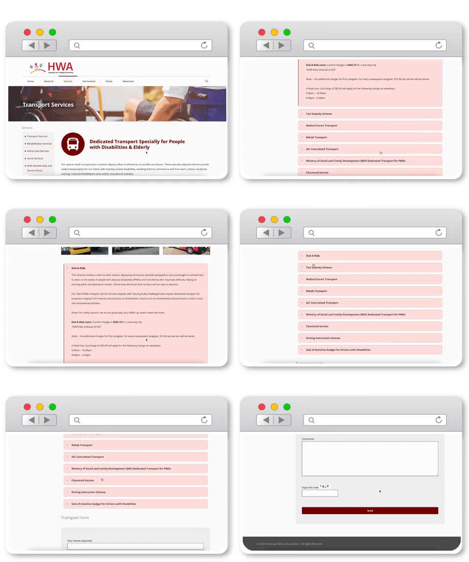
As a part of my role, I took on the task of enhancing the presentation of information on HWA's Services page, considering that HWA primarily serves as an informative website. The existing approach to presenting information on the page appeared cluttered, and I saw an opportunity to improve it by condensing certain elements. By streamlining the content, we aimed to create a more organised and user-friendly layout.
Furthermore, I actively engaged in conducting user interviews to gain valuable insights from potential users of HWA's website. This research allowed us to better understand their needs, preferences, and expectations, enabling us to tailor the website accordingly and provide an enhanced user experience.
In addition to user research and information restructuring, I played a key role in sourcing and setting up the necessary components and elements required for the prototype on Figma. This involved carefully selecting and arranging various design elements to create a visually appealing and intuitive interface for the website.
17 user interviews and 1 stakeholder interview
are conducted
17 user interviews and 1 stakeholder interview
are conducted
17 user interviews and 1 stakeholder interview
are conducted
The group spoke to 17 users of the website to better understand what they require and need for the website.
The group spoke to 17 users of the website to better understand what they require and need for the website.
The group spoke to 17 users of the website to better understand what they require and need for the website.
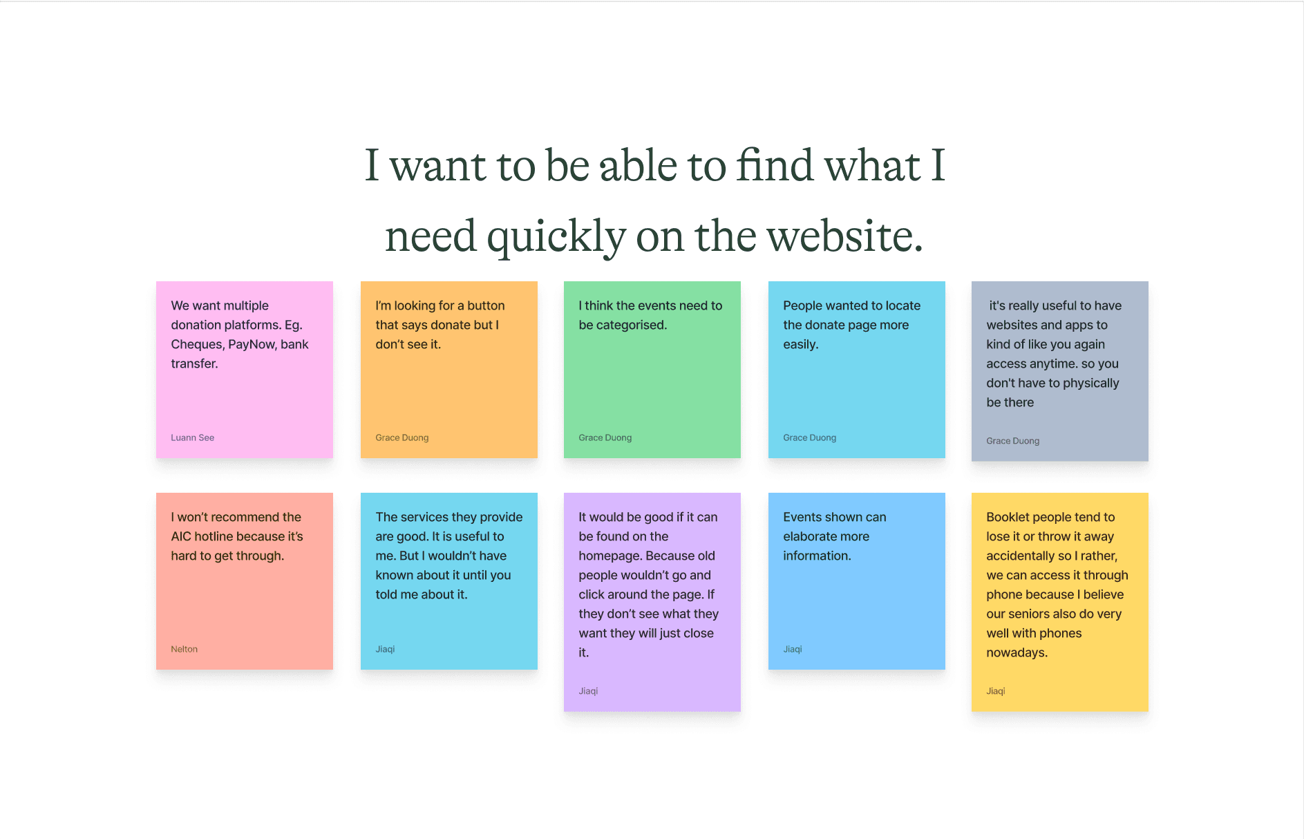
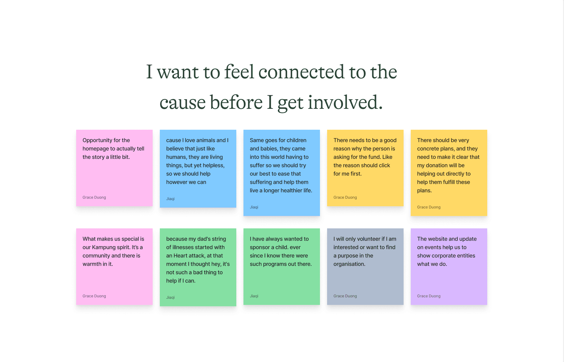
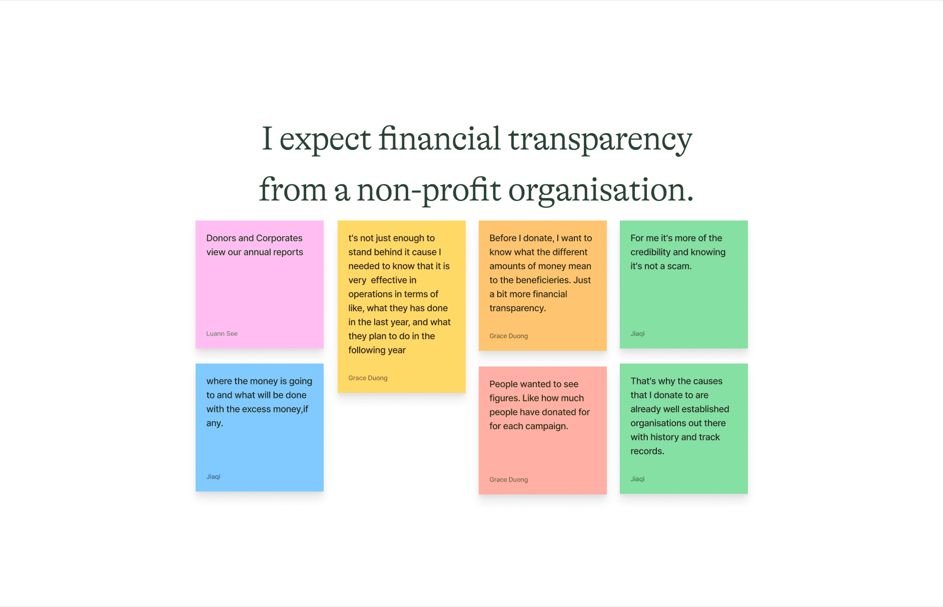
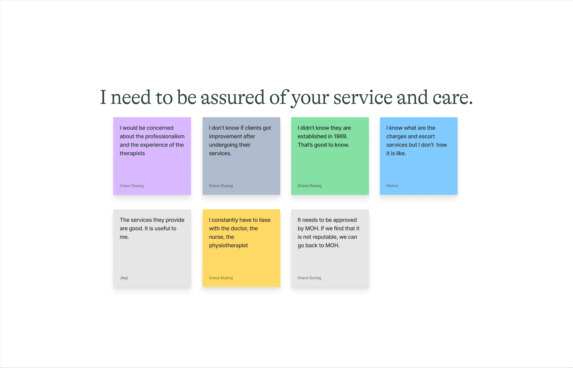
After synthesising the data collected from the user interviews conducted, 5 insights stemming from the data collected from healthcare workers, social workers, caregivers and potential donors are identified:
After synthesising the data collected from the user interviews conducted, 5 insights stemming from the data collected from healthcare workers, social workers, caregivers and potential donors are identified:
After synthesising the data collected from the user interviews conducted, 5 insights stemming from the data collected from healthcare workers, social workers, caregivers and potential donors are identified:
"I want to be able to find what I need quickly on the website"
"I want to be able to find what I need quickly on the website"
"I want to be able to find what I need quickly on the website"
"I want to feel connected to the cause before I get involved"
"I want to feel connected to the cause before I get involved"
"I want to feel connected to the cause before I get involved"
"I expect financial transparency from a non-profit organisation"
"I expect financial transparency from a non-profit organisation"
"I expect financial transparency from a non-profit organisation"
"I need to be assure of your service and care"
"I need to be assure of your service and care"
"I need to be assure of your service and care"
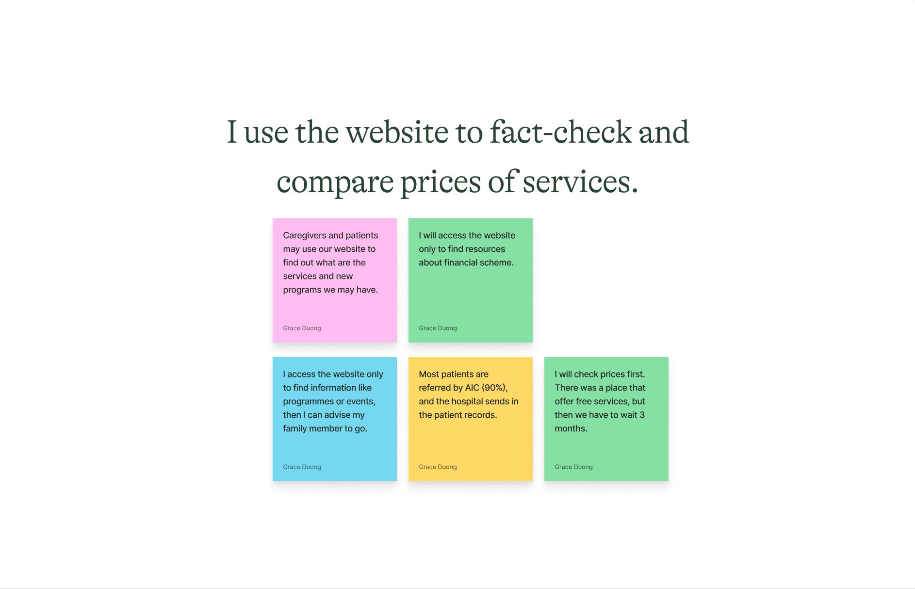
"I use the website to fact-check and compare prices of services"
"I use the website to fact-check and compare prices of services"
"I use the website to fact-check and compare prices of services"
Problem Space
Problem Space
Problem Space
As HWA caters to People with Disabilities (PwDs), we sought feedback from PwDs to improve the website. However, stakeholder interviews revealed that the main users of the website are healthcare workers, social workers, caregivers, and potential donors, rather than PwDs themselves.
User interviews highlighted that caregivers, social workers, and healthcare workers share similar needs and frustrations, which differ from those of potential donors. Therefore, we decided to prioritize potential donors as our primary persona for the redesign. Attracting and retaining donors is crucial for HWA to raise funds and support their initiatives and programs effectively.
Problem Statement
Problem Statement
Problem Statement
Users need an easier way to find information in order to be confident with donating to the organisation as well as be assured of the services it provides.
Users need an easier way to find information in order to be confident with donating to the organisation as well as be assured of the services it provides.
Users need an easier way to find information in order to be confident with donating to the organisation as well as be assured of the services it provides.
From the problem statement, we understood that we need to focus on redesigning the Homepage, Services, Get Involved as well as its Events page to improve its navigation.
From the problem statement, we understood that we need to focus on redesigning the Homepage, Services, Get Involved as well as its Events page to improve its navigation.
From the problem statement, we understood that we need to focus on redesigning the Homepage, Services, Get Involved as well as its Events page to improve its navigation.
"How might we help donors donate easily and access information quickly?
"How might we help donors donate easily and access information quickly?
"How might we help donors donate easily and access information quickly?
To answer the question, we look at applying the following 3 themes to the redesigned pages and they are:
To answer the question, we look at applying the following 3 themes to the redesigned pages and they are:
To answer the question, we look at applying the following 3 themes to the redesigned pages and they are:
Ease of finding and filtering information
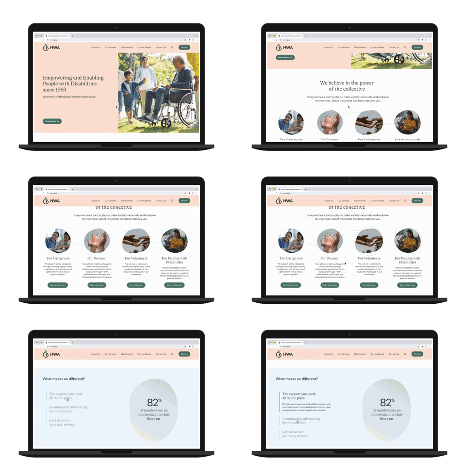
We added quick links on 'Homepage' for faster access to information as well as the use of accordions to collapse information
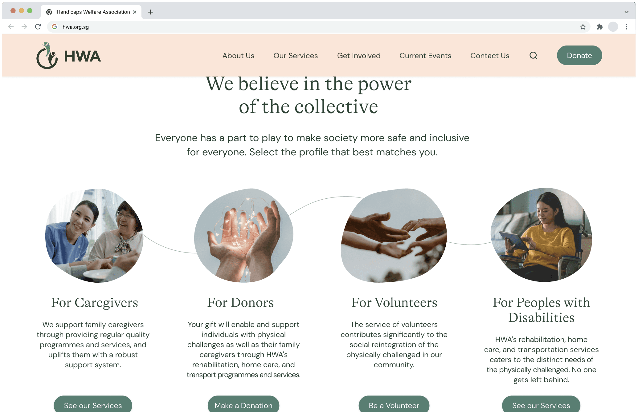


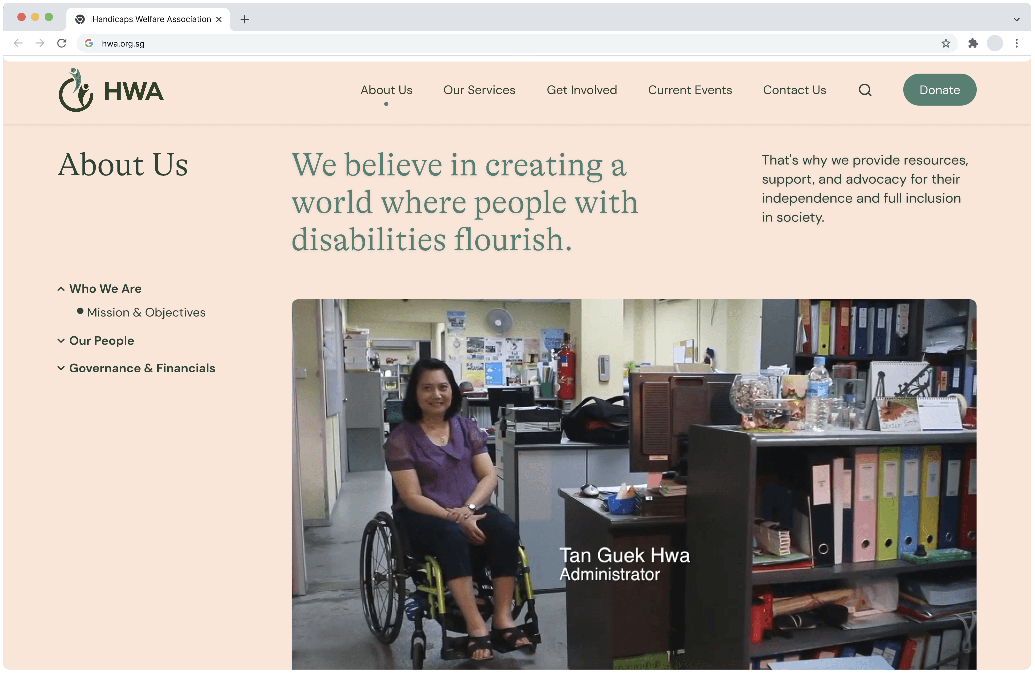
Inspire trust and confidence
We redesigned the 'Mission' page with the addition of their member's video to instil trust and confidence


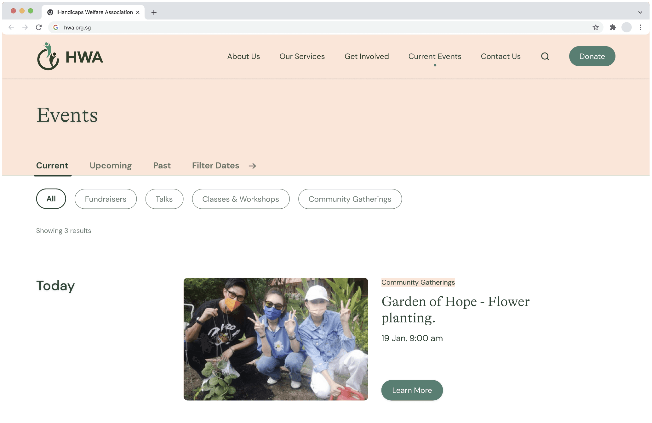
Highlight HWA's community spirit
We redesigned their 'Events' page to 'Current Events' with a more current look and feel


Ideation generated from comparative analysis
Ideation generated from comparative analysis
Ideation generated from comparative analysis
For ideation, we conducted comparative analysis on how some of the other websites that offer similar services looked like in order to gain inspiration on how to present information from a human-centered perspective.
For ideation, we conducted comparative analysis on how some of the other websites that offer similar services looked like in order to gain inspiration on how to present information from a human-centered perspective.
For ideation, we conducted comparative analysis on how some of the other websites that offer similar services looked like in order to gain inspiration on how to present information from a human-centered perspective.


We also studied the ways in which modern healthcare institutions are being presented online. This research helped inform our design decisions for the website.
Humanising imagery: Select images that depict people with disabilities in a way that highlights their personality and individuality, rather than focusing on their disability. Opt for images taken under natural, warm lighting.
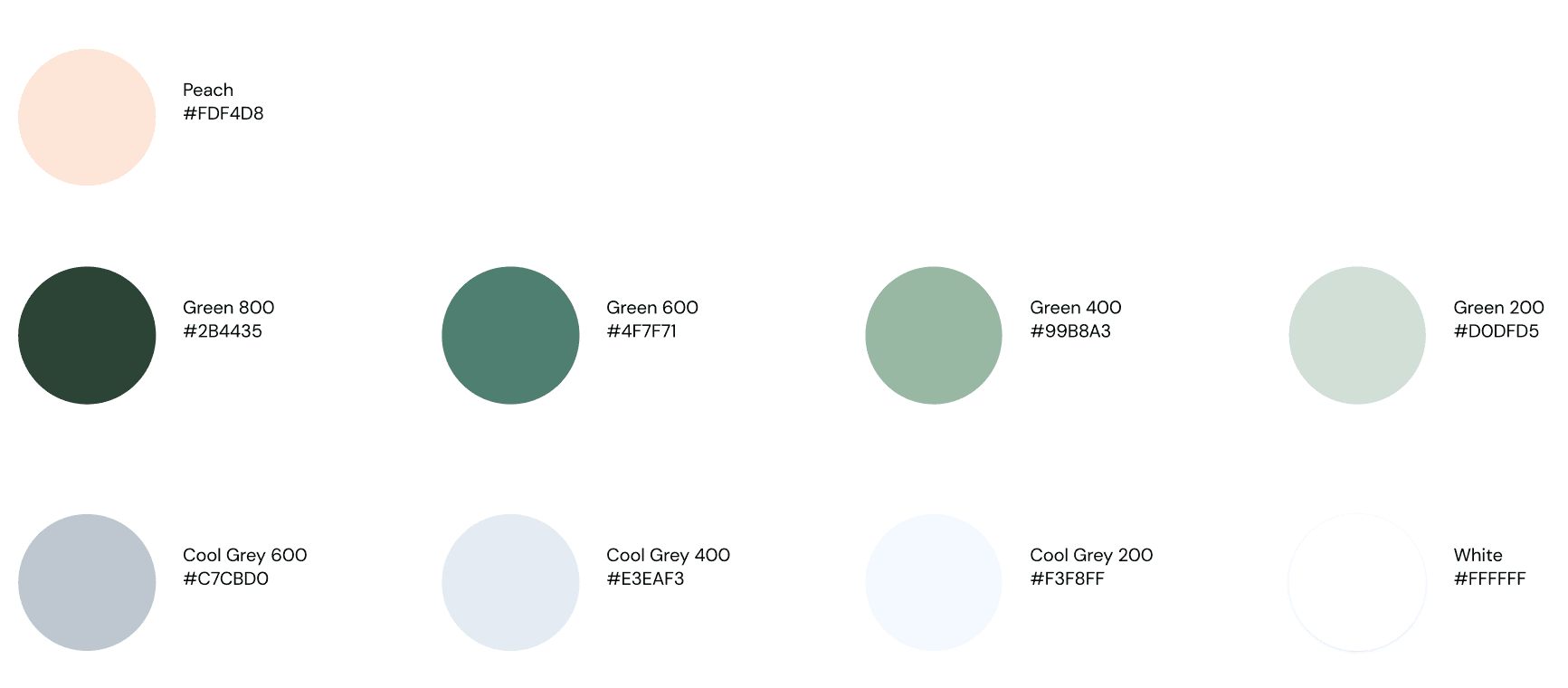
Colour Palette: Using pastel colours lend a sense of tenderness to the website. Instead of using black, use darker shades of green to add a sense of warmth and groundedness.


Sketches and wireframes
Sketches and wireframes
Sketches and wireframes
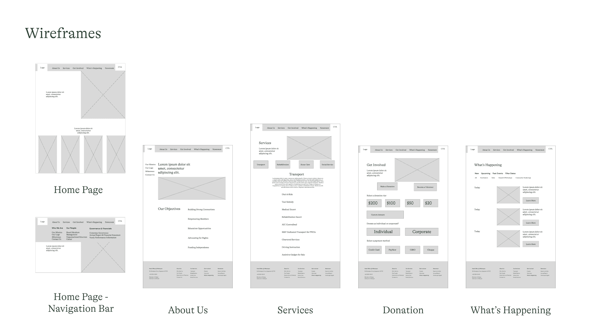
Using those websites as inspiration, we came together and sketched out how the redesigned website should look like.
Using those websites as inspiration, we came together and sketched out how the redesigned website should look like.
Using those websites as inspiration, we came together and sketched out how the redesigned website should look like.
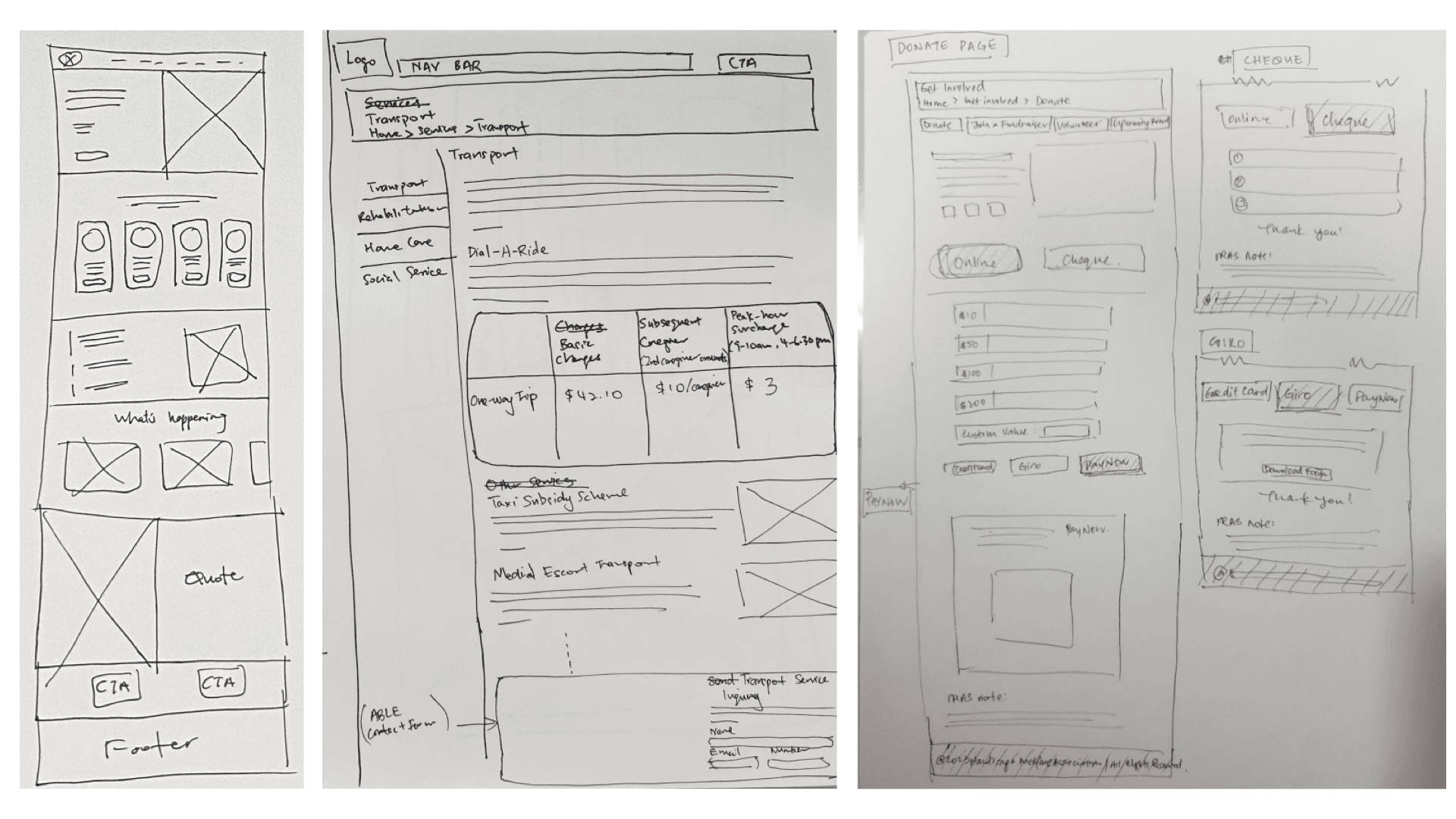


We went through many rounds of iteration before we managed to come up with how the redesigned website would look like.
We went through many rounds of iteration before we managed to come up with how the redesigned website would look like.
We went through many rounds of iteration before we managed to come up with how the redesigned website would look like.


Side by side comparison of the pages
Side by side comparison of the pages
Side by side comparison of the pages
Current Homepage
Redesigned Homepage
Current Homepage

Redesigned Homepage

Current Homepage

Redesigned Homepage

Current Services Page
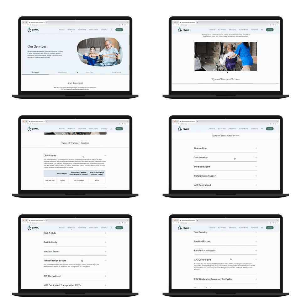
Redesigned Services Page
Current Services Page

Redesigned Services Page

Current Services Page

Redesigned Services Page

Current Donate Page

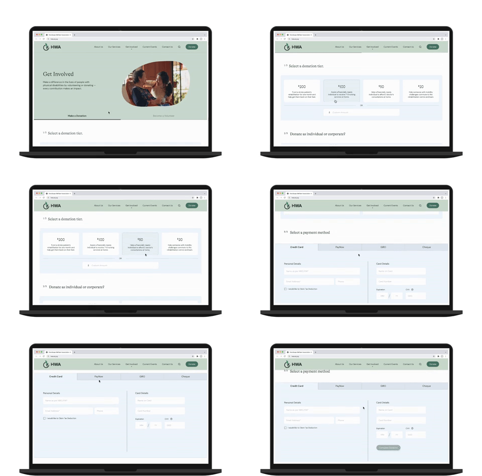
Redesigned Donate Page
Current Donate Page

Redesigned Donate Page

Current Donate Page

Redesigned Donate Page

Current Website on Mobile

Redesigned Website on Mobile

Current Website on Mobile

Redesigned Website on Mobile

Current Website on Mobile

Redesigned Website on Mobile

Conducted 2 rounds of user testing to test the usability of our prototype
Conducted 2 rounds of user testing to test the usability of our prototype
Conducted 2 rounds of user testing to test the usability of our prototype
Each round of user testing is made up of 3 participants to test the usability of the redesigned website. From the 1st round of the testing we identified some elements to improve on to make the website more intuitive and user friendly.
Each round of user testing is made up of 3 participants to test the usability of the redesigned website. From the 1st round of the testing we identified some elements to improve on to make the website more intuitive and user friendly.
Each round of user testing is made up of 3 participants to test the usability of the redesigned website. From the 1st round of the testing we identified some elements to improve on to make the website more intuitive and user friendly.
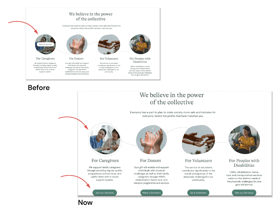
The initial hover-over effect was not intuitive in the first round of user testing. Adding buttons underneath improved the Call-To-Action (CTA) speed by 50% in the second round of testing.
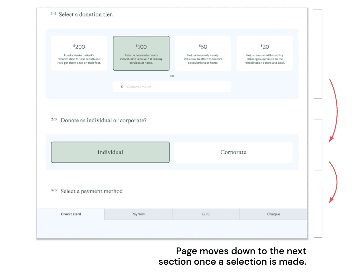
During the first round of testing, users were unsure about the next steps. To improve this, we implemented an interaction where the page automatically moves down upon completing the previous section.
In the second round of testing, users displayed increased efficiency and confidence in navigating through the sections.

The initial hover-over effect was not intuitive in the first round of user testing. Adding buttons underneath improved the Call-To-Action (CTA) speed by 50% in the second round of testing.

During the first round of testing, users were unsure about the next steps. To improve this, we implemented an interaction where the page automatically moves down upon completing the previous section.
In the second round of testing, users displayed increased efficiency and confidence in navigating through the sections.

The initial hover-over effect was not intuitive in the first round of user testing. Adding buttons underneath improved the Call-To-Action (CTA) speed by 50% in the second round of testing.

During the first round of testing, users were unsure about the next steps. To improve this, we implemented an interaction where the page automatically moves down upon completing the previous section.
In the second round of testing, users displayed increased efficiency and confidence in navigating through the sections.
Most importantly, all our users remarked that the redesigned website looks professional and that they feel more inclined to participate in events or make a donation.
Most importantly, all our users remarked that the redesigned website looks professional and that they feel more inclined to participate in events or make a donation.
Most importantly, all our users remarked that the redesigned website looks professional and that they feel more inclined to participate in events or make a donation.
Prototype
Prototype
Prototype
Utilising the three identified themes for the website redesign, we applied them consistently across various pages to create a more personable and warm aesthetic and tone. Below are the key pages we have redesigned: Homepage, Services, Get Involved, and What's Happening. Through this case study, we identified user frustrations and redesigned the website to enhance its user-friendliness and intuitiveness, ensuring that users can easily find the information they need and donate.
Below is the prototype for HWA website redesign:
Next steps
Next steps
Next steps
During user testing, we focused solely on assessing the website's usability with potential donors, who were identified as the primary persona for this case study. However, to further enhance the prototype, it is essential to conduct user testing with People with Disabilities (PWDs) as well. Although PWDs may not be the primary persona using the website, they belong to the group that HWA caters to, making their feedback invaluable in improving accessibility and inclusivity.
During user testing, we focused solely on assessing the website's usability with potential donors, who were identified as the primary persona for this case study. However, to further enhance the prototype, it is essential to conduct user testing with People with Disabilities (PWDs) as well. Although PWDs may not be the primary persona using the website, they belong to the group that HWA caters to, making their feedback invaluable in improving accessibility and inclusivity.
During user testing, we focused solely on assessing the website's usability with potential donors, who were identified as the primary persona for this case study. However, to further enhance the prototype, it is essential to conduct user testing with People with Disabilities (PWDs) as well. Although PWDs may not be the primary persona using the website, they belong to the group that HWA caters to, making their feedback invaluable in improving accessibility and inclusivity.
